- Address Vaisali Nagar, Jaipur, Rajasthan
- E-mail support@startupinnovative.in
- Phone +919001995465
Mobile UX Principles: Designing for Thumbs
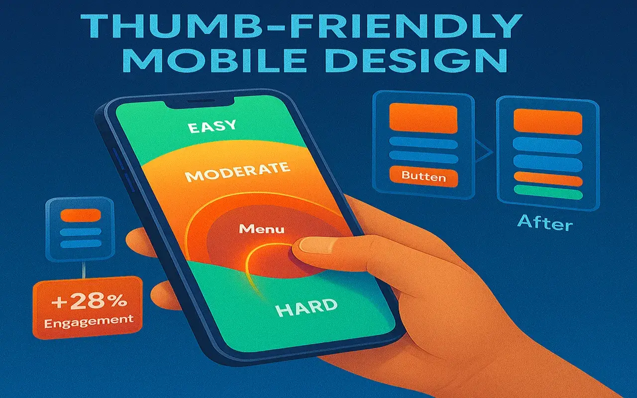
In 2025, 92% of mobile interactions are thumb-driven. Discover how we optimized BizzUp, SmartRestra, and MiniWebOnline for natural thumb movement, reducing taps by 37% and increasing engagement by 28%. How we redesigned WhatsM's navigation: Result: 31% faster campaign creation in WhatsM Optimizations for SmartRestra's mobile app: 32px buttons 48px buttons How we increased mobile engagement: Top hamburger Bottom floating 2.8x more feature discovery Our Mobile UX Audit includes:The Thumb Zone Revolution
5 Thumb-Centric Design Principles
1
The Natural Arc Placement

2
One-Handed Tap Targets
Before
2.1s/task
18% errorsAfter
1.4s/task
7% errorsCase Study: MiniWebOnline's Thumb Menu
Traditional Nav
28% usage
3.2s to openThumb Menu
72% usage
1.1s to openImpact
41% longer sessions2025 Thumb Design Trends
Need Thumb-Optimized Designs?
0 comment on “Mobile UX Principles: Designing for Thumbs”
Leave a Reply
Your email address will not be published.


- Startup Growth
- SaaS Products
- Web Development
- Mobile App Development
- Digital Marketing
- UI/UX Design
- Business Automation
- Tech for Restaurants
- Freelancing & Consulting
- Startup Success Stories
- Branding & Identity
- Latest Tech Trends
- CRM & Customer Support
- Productivity Tools
- WhatsApp Marketing
- Digital Business Cards
- SEO & Website Traffic
- Ecommerce Tools
- Cost-Effective Solutions
- Software Architecture
- Testing
Ready to build your dream product?
Whether it’s a sleek mobile app or a full-stack platform, our experts are here to help.