- Address Vaisali Nagar, Jaipur, Rajasthan
- E-mail support@startupinnovative.in
- Phone +919001995465
Mobile-First Design for Startups

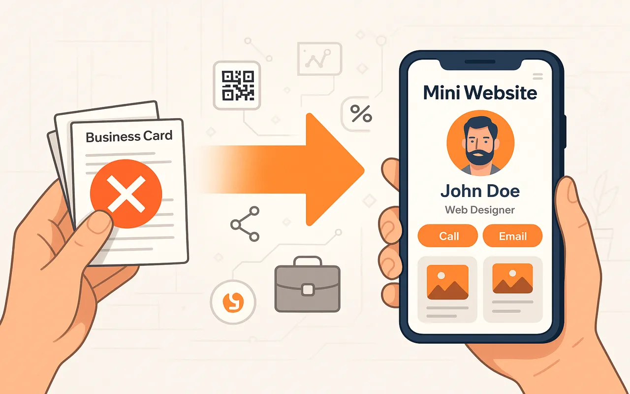
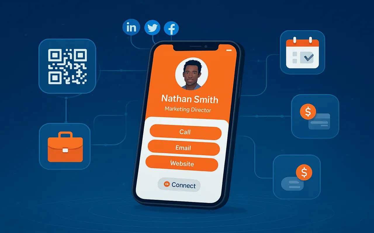
With 68% of global website traffic coming from mobile devices, startups can't afford to treat mobile design as an afterthought. Discover why mobile-first design is the smartest investment for early-stage businesses. 78% of consumers research purchases on mobile before buying (Google). Your startup's first impression is likely on a 6-inch screen. Mobile-optimized sites load 2x faster and see 50% lower bounce rates (Google). Speed directly impacts conversions. Google uses mobile-first indexing. Better mobile UX = higher rankings = more organic traffic. Prioritize essential elements: CTA buttons, contact info, and value proposition should be immediately visible without scrolling. Place key actions in the "thumb zone" (bottom 50% of screen). Our MiniWebOnline templates follow this rule. Pre-built mobile-optimized templates for instant professional presence. No coding needed. Free tool to audit mobile performance, accessibility, and SEO. Mobile-optimized social media templates that load in under 1 second. After implementing SmartRestra's QR menu system: Our startup-friendly tools and services deliver mobile experiences that convert.Why Startups Must Adopt Mobile-First
📱 User Behavior
⚡ Performance
🔍 SEO Advantage
Mobile-First Design Principles
1. Content Hierarchy
2. Thumb-Friendly Navigation
3. Speed Optimization
Mobile-First Tools for Startups
MiniWebOnline
Google Lighthouse
BizzUp Social Tools
Case Study: Restaurant Mobile Transformation
Need a Mobile-Optimized Solution?
0 comment on “Mobile-First Design for Startups”
Leave a Reply
Your email address will not be published.


- Startup Growth
- SaaS Products
- Web Development
- Mobile App Development
- Digital Marketing
- UI/UX Design
- Business Automation
- Tech for Restaurants
- Freelancing & Consulting
- Startup Success Stories
- Branding & Identity
- Latest Tech Trends
- CRM & Customer Support
- Productivity Tools
- WhatsApp Marketing
- Digital Business Cards
- SEO & Website Traffic
- Ecommerce Tools
- Cost-Effective Solutions
- Software Architecture
- Testing
Ready to build your dream product?
Whether it’s a sleek mobile app or a full-stack platform, our experts are here to help.