- Address Vaisali Nagar, Jaipur, Rajasthan
- E-mail support@startupinnovative.in
- Phone +919001995465
The Psychology of Color in Branding
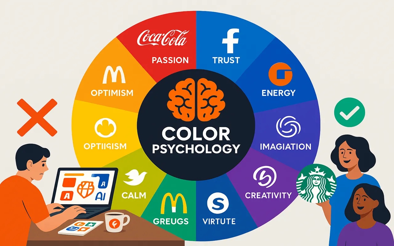
Color increases brand recognition by 80% (Kissmetrics). From Coca-Cola’s red to Tiffany’s blue—your color choices shape how customers perceive, remember, and trust your brand. Here’s how to use them strategically. Colors trigger instant emotional and psychological responses: Emotions: Passion, urgency, excitement Best for: Food (McDonald’s), clearance sales, call-to-actions Emotions: Trust, security, calm Best for: Banks (Chase), tech (Facebook), healthcare Emotions: Energy, creativity, friendliness Best for: Startups, SaaS brands, call-to-actions Emotions: Growth, health, eco-friendliness Best for: Organic brands (Whole Foods), finance, sustainability Emotions: Optimism, warmth, caution Best for: Discounts (IKEA), children’s brands, warnings Emotions: Luxury, creativity, spirituality Best for: Beauty (Milani), royalty-themed brands Match colors to your core values: Colors mean different things globally: Ensure color contrast meets WCAG 2.1 standards for readability. 1 primary (like orange #f24c1a) + 2–3 accents max. Red for "Buy Now" buttons increases conversions by 34%. Use tools like MiniWebOnline to maintain color accuracy. Color improves brand recognition by 80%. That’s why brands like Coca-Cola own specific shades (Pantone 484 C). Your brand colors aren’t just decorative—they’re silent salespeople. Choose wisely, test thoroughly, and use them consistently across all touchpoints.Why Color Psychology Matters in Branding
The Meaning Behind Key Colors
Red
Blue
Orange
Green
Yellow
Purple
How to Choose Your Brand Colors
1. Align With Your Brand Personality
2. Consider Cultural Differences
3. Test for Accessibility
3 Pro Tips for Using Color Effectively
Tip #1: Limit Your Palette
Tip #2: Use Color Strategically
Tip #3: Stay Consistent
Did You Know?
Final Thought
2 comment on “The Psychology of Color in Branding”
Leave a Reply
Your email address will not be published.


- Startup Growth
- SaaS Products
- Web Development
- Mobile App Development
- Digital Marketing
- UI/UX Design
- Business Automation
- Tech for Restaurants
- Freelancing & Consulting
- Startup Success Stories
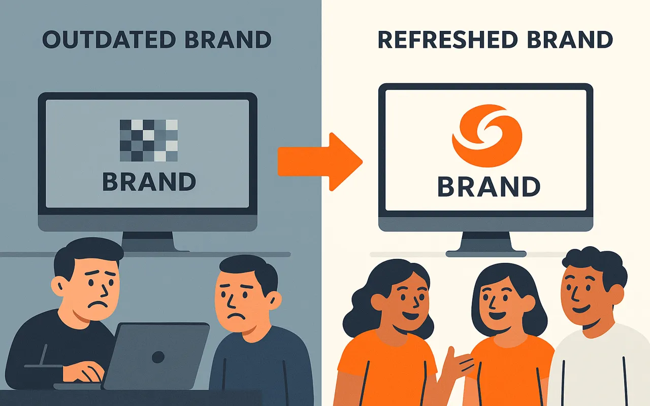
- Branding & Identity
- Latest Tech Trends
- CRM & Customer Support
- Productivity Tools
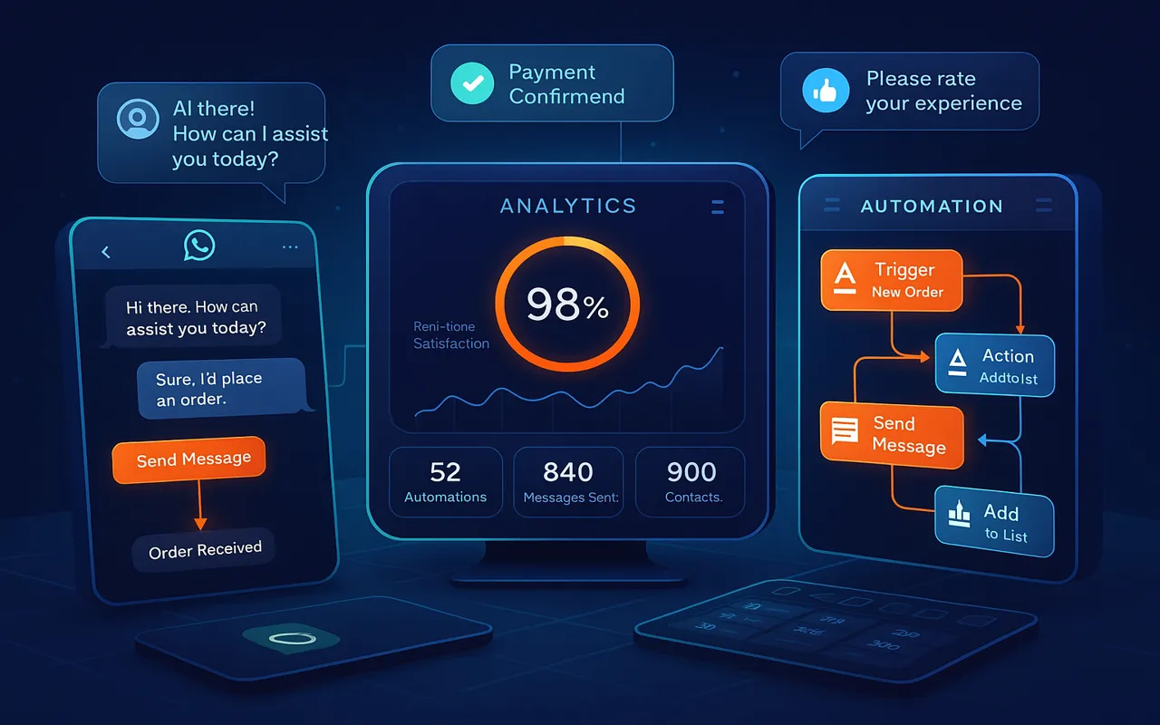
- WhatsApp Marketing
- Digital Business Cards
- SEO & Website Traffic
- Ecommerce Tools
- Cost-Effective Solutions
- Software Architecture
- Testing
Ready to build your dream product?
Whether it’s a sleek mobile app or a full-stack platform, our experts are here to help.
Comment: Color psychology is fascinating. Very well explained!
Comment: I’ll definitely rethink my color choices now.