- Address Vaisali Nagar, Jaipur, Rajasthan
- E-mail support@startupinnovative.in
- Phone +919001995465
Dark Mode Done Right: UI Design Best Practices

In 2025, 82% of users prefer dark mode - but most implementations hurt usability. Here's how we designed dark mode for BizzUp and SmartRestra that increased engagement by 37% and reduced eye strain complaints by 63%. How we adjusted colors for MiniWebOnline's dark mode: Key Adjustments: Brightened primary color by 15%, reduced text contrast ratio to 4.5:1, added subtle warm gray backgrounds Our approach in WhatsM: Flat hierarchy Clear depth How we implemented dark mode for restaurants: Used #E0E0E0 on #1E1E1E Added subtle glow borders 87% adoption rate Our UI Audit includes:Why Dark Mode Matters More Than Ever
5 Dark Mode Design Principles
1
Smart Color Adaptation
2
Depth Hierarchy with Elevation
Before
32% misclicks
2.4s task timeAfter
11% misclicks
1.7s task timeCase Study: SmartRestra's Dark Mode Success
Menu Readability
58% better in low lightImage Treatment
41% more clicksResult
29% more orders2025 Dark Mode Innovations
Need Expert Dark Mode Design?
0 comment on “Dark Mode Done Right: UI Design Best Practices”
Leave a Reply
Your email address will not be published.


- Startup Growth
- SaaS Products
- Web Development
- Mobile App Development
- Digital Marketing
- UI/UX Design
- Business Automation
- Tech for Restaurants
- Freelancing & Consulting
- Startup Success Stories
- Branding & Identity
- Latest Tech Trends
- CRM & Customer Support
- Productivity Tools
- WhatsApp Marketing
- Digital Business Cards
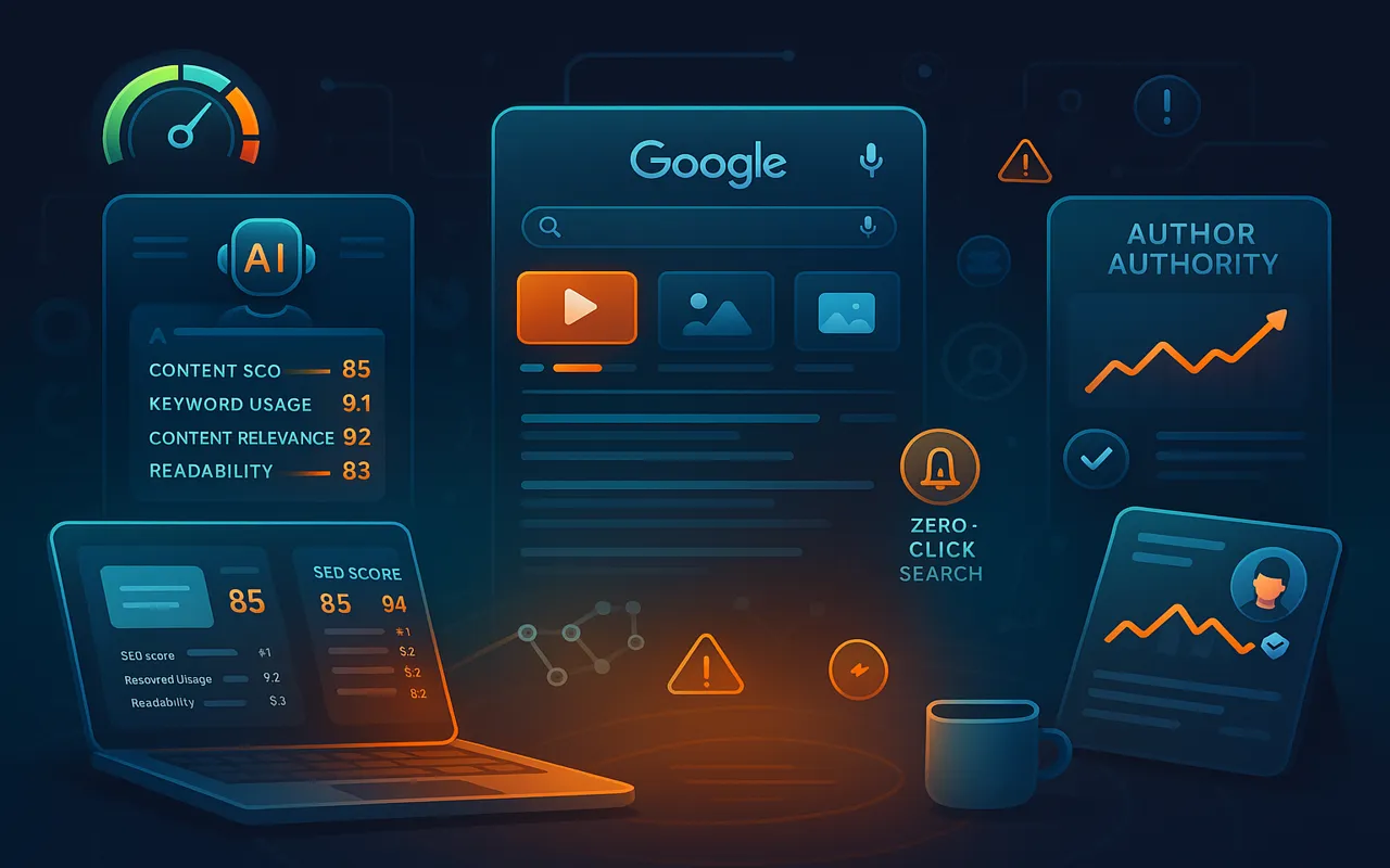
- SEO & Website Traffic
- Ecommerce Tools
- Cost-Effective Solutions
- Software Architecture
- Testing
Ready to build your dream product?
Whether it’s a sleek mobile app or a full-stack platform, our experts are here to help.